
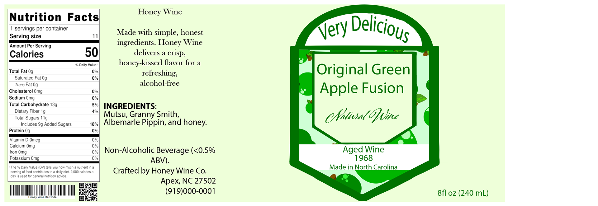
Honey Wine
Beverage Label Design Case Study
Beverage Label Design Case Study
Client: Jaime Renville
Company: Honey Wine
Project Type: Beverage Label
Project Date: 11/17/2025
Company: Honey Wine
Project Type: Beverage Label
Project Date: 11/17/2025
Role: Product Label Designer
Company: Kristen White Designs
Company: Kristen White Designs
Project Overview
To design a professional packaging system for Honey Wine, a non-alcoholic, fruit-based beverage. The outcome is to develop a visually appealing, market-ready label that communicates freshness, natural ingredients, and a sophisticated, alcohol-free drinking experience.
Goal
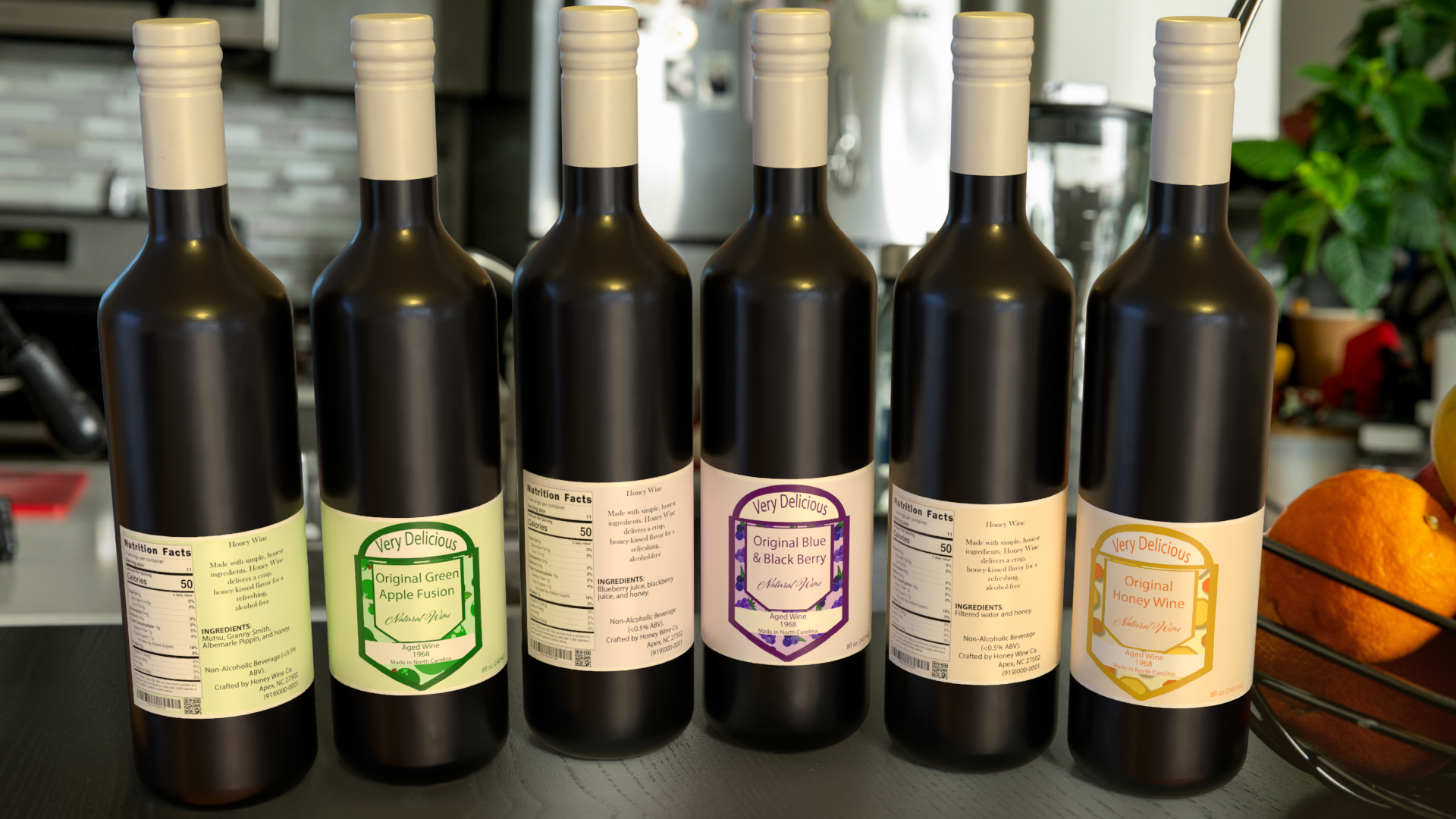
The customer wants 3 non-alcoholic options. I created three original flavors: Honey, Blue & Black Berry, and Green Apple Fusion. Multiple labels and mock-ups are provided.
The Challenge
Elevate a non-alcoholic beverage while maintaining its appeal to wine enthusiasts.
Design Solution
Develop a classic wine label aesthetic that resonates with a broad consumer base.
Target Audience
The ages (Primary), 16 – 35, and (Secondary), 35 – 55. Those who have an average income of $35,000 to $90,000 (middle class). People with a high school diploma or a college-level education. Urban or Suburban regions; Shoppers who frequent natural food stores or farmers' markets.
People who are health-conscious individuals seek an alcohol-free alternative. Those who appreciate natural, clean ingredients. While being social but mindful consumers, young adults who want to feel “grown-up” or families who prefer inclusive beverages for gatherings.
Future buyers who will value beautiful packaging, artisanal products, and fruit-forward flavors.
Design Process
The main idea for this product is that “honey” is the driving force for this wine’s overall design. What do you think of first when you see honey? Bees, so the color palette was selected based on different tones and shades of yellow, just like honeybees. At the same time, including honeycombs to illustrate the design centered on honey.
After receiving some feedback, I decided to change the color palette to resemble how honey changes color: its hue shifts based on how light reflects off its surface. Also, added additional wine flavors with their corresponding color palette.
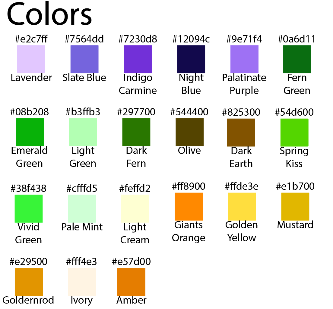
Colors
The flavor type changes what pattern is used for the wine. Here is a list of each color family or alternative name. The pattern and labels section below presents how each medium was used.
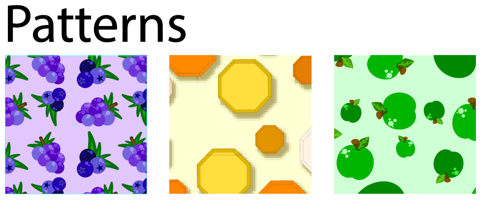
Patterns & Labels
The colors section above shows what colors were used to create each pattern.
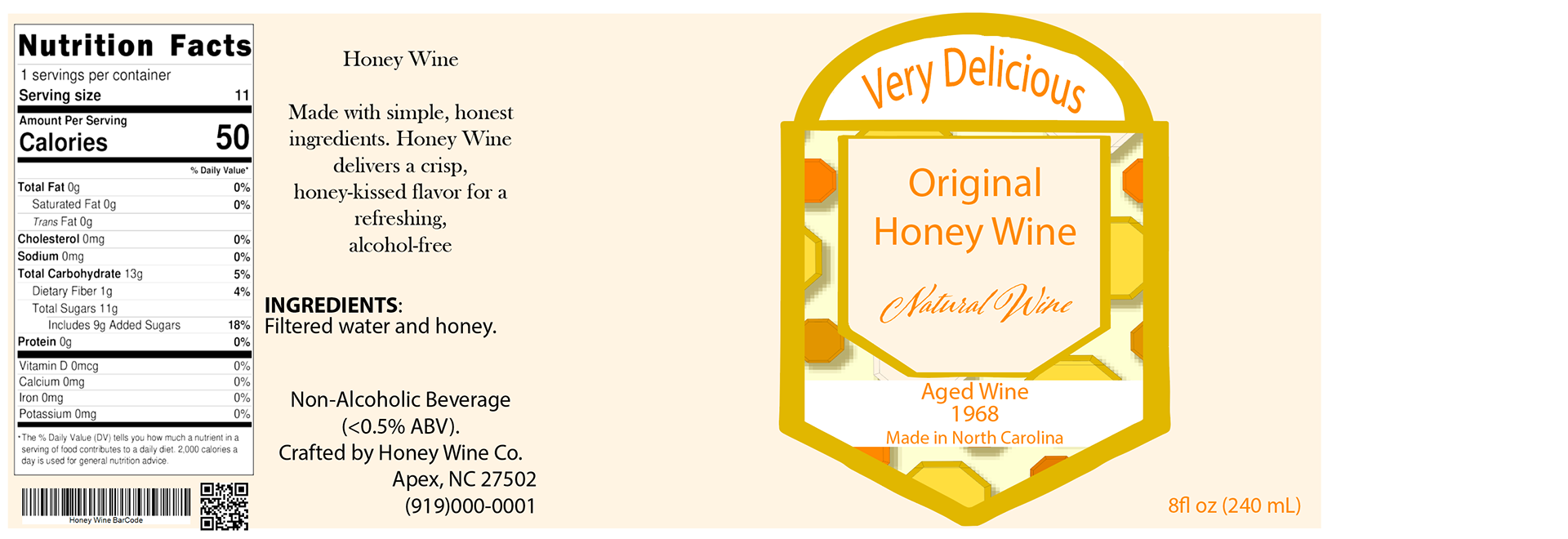
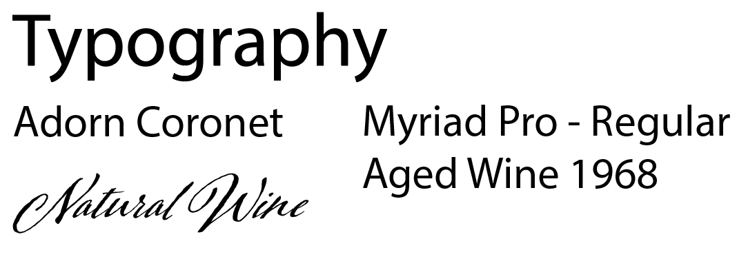
Typography
The labels use two different fonts. Body text is Myriad Pro (Original ...), and Adorn Coronet is for the product type (Natural Wine). The final label version is below this section.


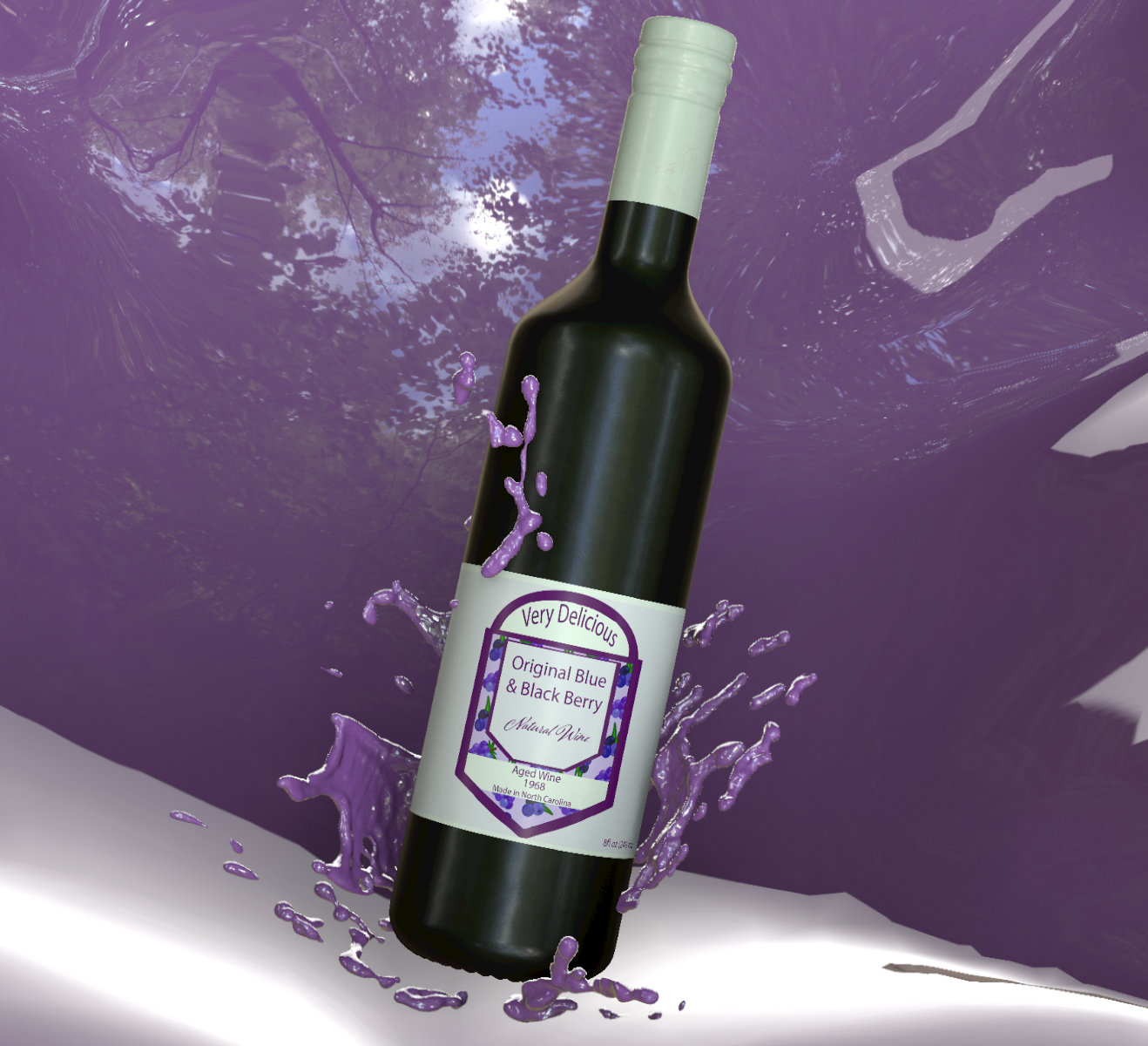
Marketing Advertisement
The goal was to promote Honey Wine to the target audience by highlighting the product's natural ingredients and alcohol-free experience. The design focuses on presenting the beverage as a sophisticated alternative while still appealing to health-conscious consumers.
Results
Increase purchases from ads spent on the target audience who typically want an alcohol-based wine.
Reflection
While working on this beverage label design, I learned the importance of creating packaging that clearly communicates the product’s identity and audience. Designing for a non-alcoholic wine required balancing a classic wine aesthetic with a fresh and natural feeling. Through feedback and revisions, I refined the color palette and visual elements to better represent the brand and its natural ingredients.
Next Steps
If the Honey Wine brand continued to develop, the visual system could expand into additional materials such as product advertisements, social media promotions, and packaging variations for different flavors.